
Here is the t-shirt design we used for our stake youth conference this year:
We wanted there to be meaning behind the shirt. This is what we came up with...
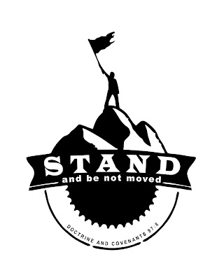
- The mountain - represents the mountain of the lord/temple.
- Youth standing on top of the mountain - represents both the young men and young women.
- The tattered flag - represents what they stand for, personal title of liberty.
- The gear - though we stand firm in the gospel, we are always moving the work forward through service.
- ... or the sun - anchored in Christ, the son of God.
I loved that there were seniors involved in the process. We sat down and talked about what they wanted the design to look like, they sketched, changes were made, and eventually the final design was approved.
*


*
When it came time to pick out colors for the t-shirts, our senior co-chairs took the lead. They chose charcoal (for all the seniors), indigo blue (for all the adults), and pistachio, orchid, daisy, red, Carolina blue, jade dome (teal), tangerine, and ice grey for all the youth.
*

*
A text went out Monday night encouraging all those who attended youth conference over spring break to wear their t-shirts to school on Tuesday. Tuesday, after school, one of the seniors come by my house and she was so proud of the t-shirts she helped design. As she should be! :)
*

*
Kenneth Cope sporting one of our t-shirts. :)
*
